How to make sense of various charts and diagrams
The writing part of the IELTS exam is divided in to 2 sections. In this blog, you learn some important tips that can help you get a high band score. Here are 5 tips to help you improve your IELTS band written score, which are the sort of useful tricks you can learn on our IELTS Course in Malta.
In task 1, it might be tempting to look at the image of the graph or diagram, and interpret the data or image. This is something that you must avoid, as the point of the task is not to interpret, but to write what you see. When there is data in the form of a graph, you will always see at least two graphs with some disparities. It is important that you use comparative language in order to answer the question properly. Furthermore, it is important that you structure your writing carefully, and you should also avoid falling into the trap of presenting your work in an essay format, as this is not what task 1 requires of you. Below is an example of how you can structure your answer for task one.
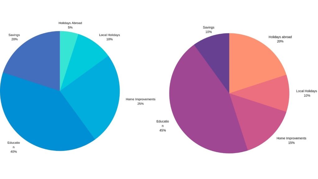
Below are two pie charts that compare family disposable income
Family Disposable Income expense in 2009 Family Disposable Income expense in 2019
The pie charts above show a comparison in family disposable income expense between 2009 and 2019. In both charts, it is visibly clear that the greatest expense is Education, which has seen a 5% increase over the 10-year period from 40% to 45%. At the other end of the scale, the figure for Local Holidays has remained consistent at 10%. (Note, this is not the same as an essay introduction and the person has provided two examples that in this case have remained relatively consistent).
The biggest disparity between the two graphs lies with the expenditure on Holidays Abroad. This category has seen a rise from 5% to 20% over the span of 10 years. Remarkably, both Home Improvements and Savings have seen a drop of 10% over the course of the decade. (In this section, the person has chosen two categories that have seen the biggest changes. You will also see the person has avoided the use of repetitive language to say the same thing at times).
The example above falls short of the required word count, but what it does show is the structure you can apply to achieve the task. Below are some phrases that you can also use to help compare two pie charts.
In contrast,… On one hand…
On the other hand… While…
Whereas… That being said….
As for…. Similarly….


